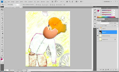
Finally i have came out with my three different final artwork and i have to choose one out of three as my final for exhibition. So before i proceed to my final one i would like to explain abit on how i came out with this three artwork by using Adobe Photoshop and Illustrator CS4.
Firstly, I took some pictures with my compact camera as i was advised by Mr Deepak to create 3-Dimensional feel on my artwork. I took a picture of an broken egg for my first artwork. My first artwork is a human with broken egg head lying on the road.
This is a kettle i shoot in my house. In my second artwork i would include this kettle in a few of my audience's head to give a sense of boiling (mad) feeling to the audience. Audience would be in the cinema watching movie and there will be a particular person in red who is talking on the cellphone.
I downloaded this picture of a badminton racquet on the web because the picture i took with my compact camera could hardly be edited. So then, i decided to dowload this picture and used it on my third artwork.
Working with Adobe Photoshop CS4.
I opened my picture with photoshop and then i used the quick selection tool to select the part i wanted to cut out.
Then, i pasted the broken egg i have cut out earlier on my first artwork. I developed my first artwork by scanning the sketches into my laptop. From the sketch, I actually filtered it with blur using surface blur function. I also adjusted the levels of my artwork to make the color brighter and obvious from my sketching.
Secondly, I used the quick selection tool to cut out the unwanted part of my kettle.
I placed the kettle on the audience head accordingly and I used the distort function to get distorted effect out of my kettle. I did the same thing as the first one by filtering it blur with surface blur. The second layer for the person who is talking on the phone I over-blend it with red color. I also adjusted the levels of this sketchMy last but not least badmindton racquet. I used the quick selection tool to cut out the unwanted part as well
I filtered it blur with surface blur just exactly like my first and second artwork. I adjusted the levels to stronger so my artwork painting would look more obvious compared to my sketching ones.
Working with Adobe Illustrator CS4.
After i have finally finished my editing with photoshop, i then proceed to illustrator to place my typography.
For the title No Cellphones Allowed I added distort, diffuse glow effect on it. As for the tagline don’t talk and drive I used the artistic effect underpainting. While the article was just the original font Absender I have downloaded from the web with no added effect on it.
The title no cellphones allowed I used the sketch effect bas relief to have this outcome. Tagline silent was a simple and original font Absender downloaded from web with no editing work on it. Lastly my article I added red strokes on the outline of the fonts to make my article look easier to read instead of pure white.
For the third artwork, there is no special or any added effect for my article and title but my tagline I added green strokes for the font outline.
Here is the final three artwork which is ready to be presented.


No comments:
Post a Comment