Monday 21 November 2011

How did i came out with the three final artwork..


Finally i have came out with my three different final artwork and i have to choose one out of three as my final for exhibition. So before i proceed to my final one i would like to explain abit on how i came out with this three artwork by using Adobe Photoshop and Illustrator CS4.

Firstly, I took some pictures with my compact camera as i was advised by Mr Deepak to create 3-Dimensional feel on my artwork. I took a picture of an broken egg for my first artwork. My first artwork is a human with broken egg head lying on the road.

 This is a kettle i shoot in my house. In my second artwork i would include this kettle in a few of my audience's head to give a sense of boiling (mad) feeling to the audience. Audience would be in the cinema watching movie and there will be a particular person in red who is talking on the cellphone.

I downloaded this picture of a badminton racquet on the web because the picture i took with my compact camera could hardly be edited. So then, i decided to dowload this picture and used it on my third artwork.

Working with Adobe Photoshop CS4.

  I opened my picture with photoshop and then i used the quick selection tool to select the part i wanted to cut out.


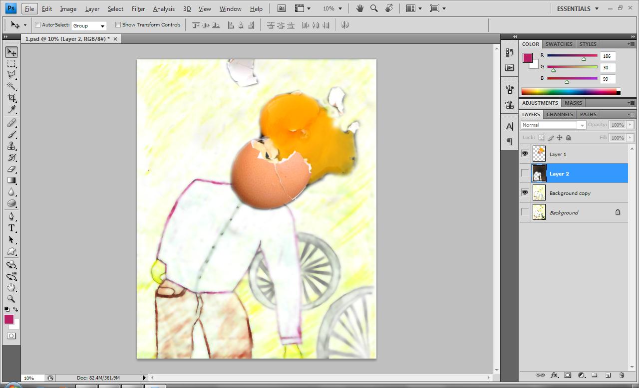
Then, i pasted the broken egg i have cut out earlier on my first artwork.  I developed my first artwork by scanning the sketches into my laptop. From the sketch,  I actually filtered it with blur using surface blur function. I also adjusted the levels of my artwork to make the color brighter and obvious from my sketching.
Secondly, I used the quick selection tool to cut out the unwanted part of my kettle.
I placed the kettle on the audience head accordingly and I used the distort function to get distorted effect out of my kettle. I did the same thing as the first one by filtering it blur with surface blur. The second layer for the person who is talking on the phone I over-blend it with red color. I also adjusted the levels of this sketch


My last but not least badmindton racquet. I used the quick selection tool to cut out the unwanted part as well


I filtered it blur with surface blur just exactly like my first and second artwork. I adjusted the levels to stronger so my artwork painting would look more obvious compared to my sketching ones.


Working with Adobe Illustrator CS4.

After i have finally finished my editing with photoshop, i then proceed to illustrator to place my typography.


For the title No Cellphones Allowed I added distort, diffuse glow effect on it. As for the tagline don’t talk and drive I used the artistic effect underpainting. While the article was just the original font Absender I have downloaded from the web with no added effect on it.


The title no cellphones allowed I used the sketch effect bas relief to have this outcome. Tagline silent was a simple and original font Absender downloaded from web with no editing work on it. Lastly my article I added red strokes on the outline of the fonts to make my article look easier to read instead of pure white.


For the third artwork, there is no special or any added effect for my article and title but my tagline I added green strokes for the font outline.


Here is the final three artwork which is ready to be presented. 


Wednesday 19 October 2011

The Sketches

Body Language

Body Language

Body Language

Body Language

Expressions

Expressions

Expressions

Hand Sign

Hand Sign

Road Safety

Road Safety

Anti-Smoking

Anti Smoking

Anti Smoking


Wednesday 21 September 2011

Thomas Dewing's Artwork..

This is the artwork i like the most from Dewing..but somehow im abit confused by this artwork..im uncertain with the person on the 1st left is a man or women. This is the reason i did not choose this to present on my 1st assignment.. :)

The Days

My others favourite artwork from Dewing

Summer

The Spinet

Lady with a lute


Me,Myself and I

My name is Stephanie Yong , a student who is currently pursuing my Bachelors of Communication (Marketing Communication) in HELP University. Im currently in my second year third semester and hope to graduate as soon as possible :)


I love taking pictures

Travelling with friends

I love my sister

and i love my cat too!

Design Project Part 1

The 1st assignment of this subject is to research and refer art movement and find out the principles of design and elements of design of an artist to an artwork.


The chosen artist: Thomas Dewing


He is best known for his tonalism|tonalist paintings, a sub-genre of American
art that was rooted in English Aestheticism.
Dewing's most common vehicle of artistic expression is the female figure.
Often seated playing instruments, writing letters,or engaged in other 
impassive actions and situated in gauzy, dreamy interiors, the figures remain 
remote and distant to the viewer.
These scenes are tinged with color that pervades the entire picture, setting 
tone and mood.Some feminist critics have lambasted Dewing's work as being 
misogynistic,he rarely painted anything other than the female figure decked in sumptuous clothing with vacant expressions.


What is Tonalism?

 Tonalism is an American artistic movement that was started in the late 1800's. The movement is used to describe the dark landscapes that were said to have been influenced by the French Barbizon artists. The color in a tonalist painting has a predominantly even darker color and can be associated more with moonlight than sunlight. Luminism emphasizes light in painting just as impressionism does, but without strong brushstrokes. Tonalism is in contrast to Luminism.


Dewing's Artwork:

The Lute


Principles of Design


Rhythm/Repetition: In this artwork there are four ladies which look very similar but each of them have different pose. The repetition of the dress colour and shape of the lady sitting down is repeated.


Unity:In this artwork it has a variation of ladies with different pose and it achieves unity because these ladies looks similar but different. This makes the artwork much more interesting to look at.


Balance: This artwork is considered a balance artwork by position as the three ladies on the left are being balanced out by the only lady on the right.


Elements of Design


Colour: The colour of this artworks is abit dull but it creates an imagination kind of feeling when looking at it. Green is a nature colour and it is also known as a safe colour and favoured by well balanced people.


Value: The overall of this artwork is lightness and lack of contrast


Sunday 11 September 2011

First Time Blogging

Hihi,this is the first time i am actually blogging and never in my life i thought i would actually blog..somehow i am feeling excited and i dont know what to blog.. :)
As excited as the emoticon :D